Project: STREMR – A Case Study
LETR is an iOS app designed to keep you connected
◊ Overview
letr is a project that was created during the height of the Pandemic, and is a response to the social isolation and disconnection from all that we love during the long stretches of isolation.
Role: UX Researcher, UI Designer & Product Designer
Tools: Figma, Adobe XD, InVision
◊ Problem Space
The pandemic increased our feelings of isolation and loneliness.
How Might We improve the quality of interactions between people in order to strengthen relationships and community?
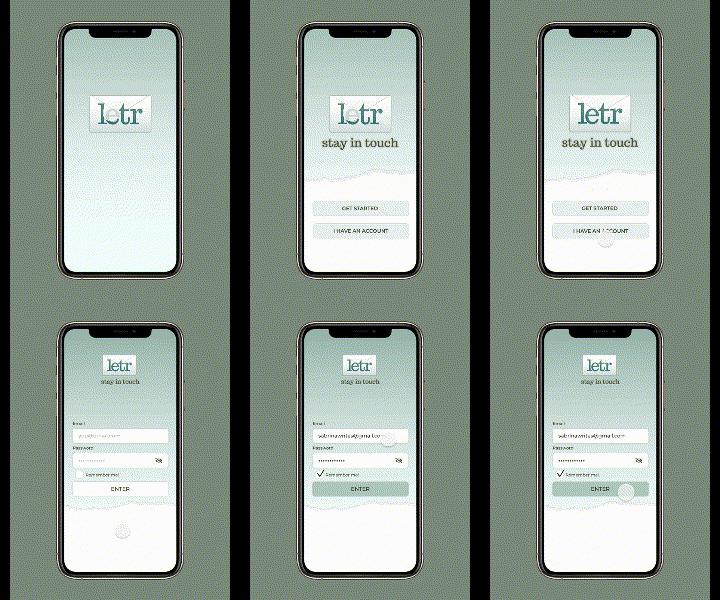
A few points on the process behind this project:
- The goal for this project was “connection.”
- I wanted something that was easy, and wouldn’t burden the user with more social media interactions.
- The constraints were to work with various users’ behaviours and to find a middle-ground between ease and functionality.
- The constraints were to work with various users’ behaviours and to find a middle-ground between ease and functionality.
- I had to overcome my own biases of what I wanted this to become, or be too outcome-oriented, and focus on the Problem Space.
- Revisiting the Design Thinking Process, and knowing it isn’t a linear trajectory, kept me focused and in the Problem Space.
DEVELOPMENT
◊ EXPLORING POSSIBILITIES
Since the pandemic hit more and more people are feeling more isolated and feel connected to others. Social media offers a very superficial connection to most people, often decontextualized by the “scroll.”
This period in time has really highlighted the importance of real human connection, and it is something that is not being met currently without causing individuals a feeling of anxiety.
This issue affects most people that are digital-natives, especially people that live in cities without other family or roommates, or with people that they want to have regular contact with.
The ultimate impact I am trying to achieve is to offer a solution for people that want to keep track of their friends and family in a more meaningful way that isn’t just the superficial scroll of social media.
Ways to alleviate pain-points the problem-space causes is by offering them ways to connect with people in a way that feels more meaningful than just a social media contact.
◊ KEY FINDINGS
I believe that by giving people easy-to-use tools and methods to keep in regular contact with friends and family that they will feel a stronger sense of community and will make efforts to stay connected.
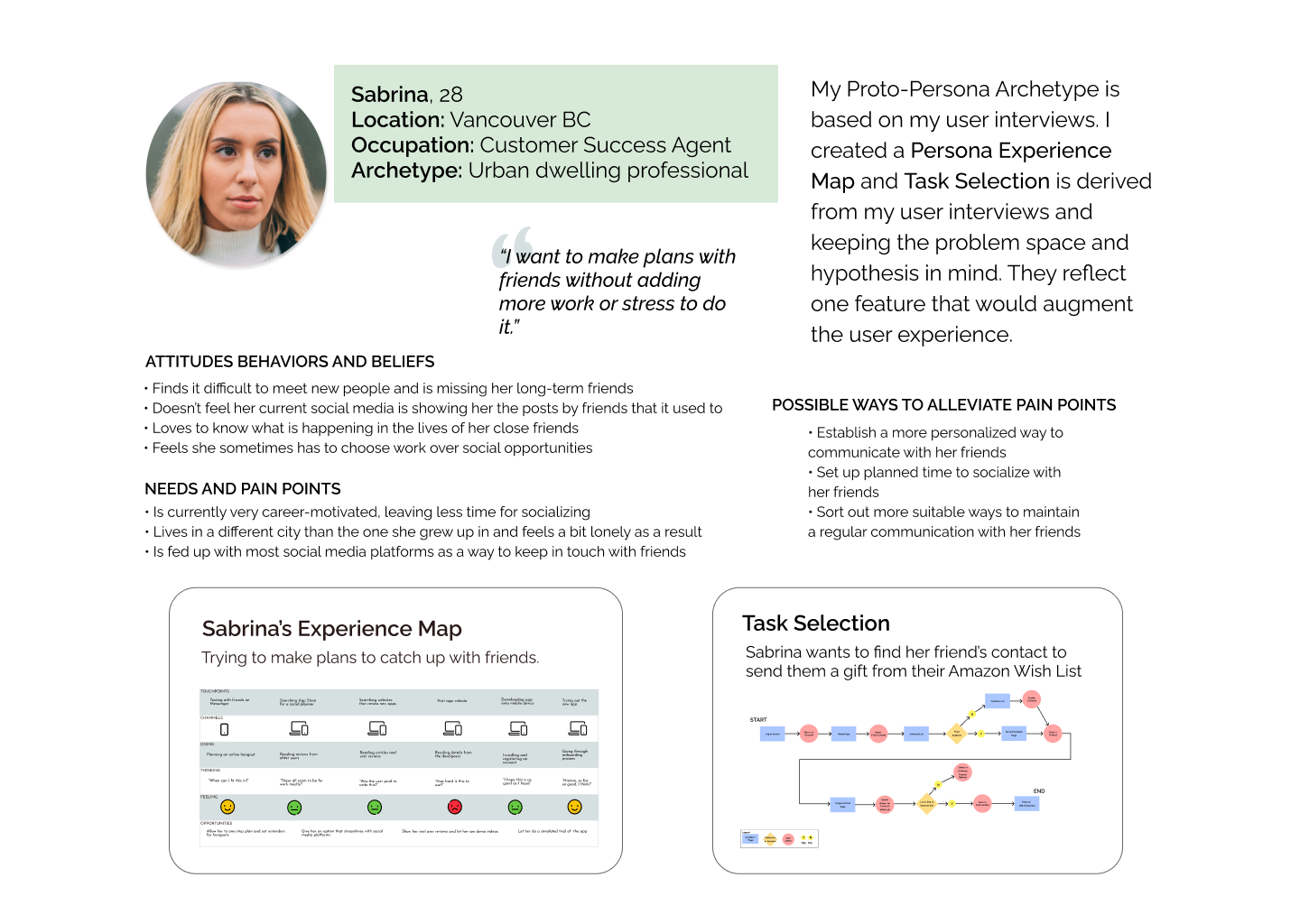
In summary, the interviewees all tried some methods to keep in touch with friends and family and were open to the methods their friends preferred. They all ranked Text Messaging as their primary Go-To, followed by Messenger.
The majority of them didn’t want to be the first person to contact someone, for fear of interrupting them, and appreciated when someone made a point to send an unprompted message to them.
MAIN CONSIDERATIONS AFTER 2 ROUNDS OF USER TESTING
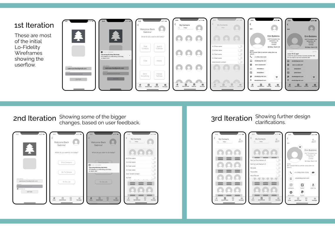
- Changed Filters Options for more clarity.
- Changed the User Icon and added a Settings symbol for improved distinctions.
- Changed the layout on the Individual Contact Page for more clarity. There was a second Confirmation modal added at the end of the flow to strongly signify the user was about to leave the site.
DESIGN ITERATIONS
◊ PEN & PAPER SKETCHES | LO-FI WIREFRAMES ◊

PROTO-PERSONA
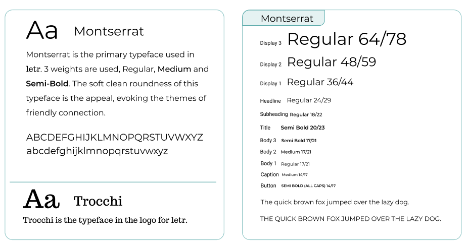
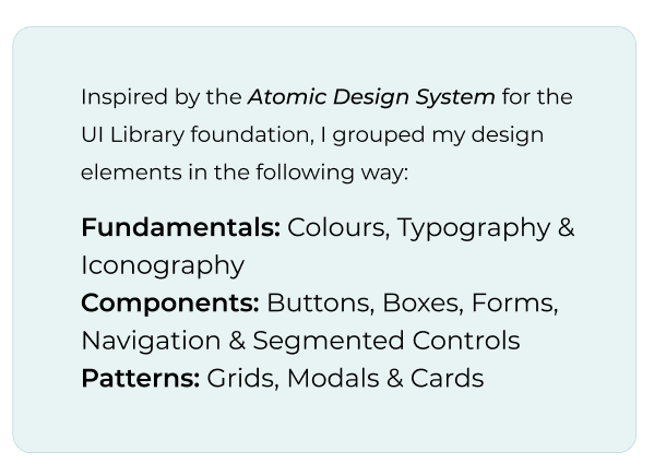
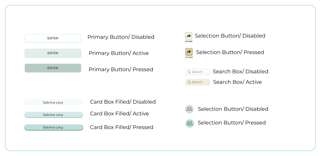
DESIGN SYSTEM

DESIGN IMPACT & FUTURE CONSIDERATIONS
◊ WHAT I LEARNED
Based on my research as well as my observation of the social landscape, I feel an app like letr would provide an opportunity to connect in ways that aren’t currently happening.
We are in an unprecedented moment in our modern history, and it will take us, as social humans, to adjust to the world again. It is forever changed, and so are we.We need to seek out ways to remain connected, and letr provides a way to do that.
My personal takeaway throughout the entire design process of letr was to remember to stay in a neutral space when collecting research and data, and to remind myself that the real solutions develop in a place of ambiguousness. Don’t focus on the outcome, rather embrace the uncertainty of the problem space to truly discover the most interesting paths to solutions.
Ultimately, this thinking will make me a better User Experience designer.
◊ VALUE PROPOSITION
letr’s main competitive advantage is that it allows the user to control what information they want, or don’t want, to share. It also allows for quick sharing updates, something to consider in this time of relocation and exploration in the lives of many young people.
There are several Contacts Management Apps on the market, but they are geared for more of a business use, to keep track of work associates, scheduling meetings etc. letr appeals to the everyday user in the way that social media does. It lets the user keep track of their close connections, and interact with them in more meaningful ways.
◊ RISK MANAGEMENT
During all the phases of my research, I witnessed and learned that people have many different preferences when it comes to utilizing more digital tools. One of the main marketing objectives would be to showcase the ease of letr. It is cloud-based for easy cross-platform syncing. The ability to quickly send a friend a gift via their public wishlist or quick cash via PayPal or Venmo are high selling features, so an emphasis on these capabilities in marketing campaigns would be an asset.
A/B testing would be implemented to gain further insights into usability and interaction details, helping to define the design even further.
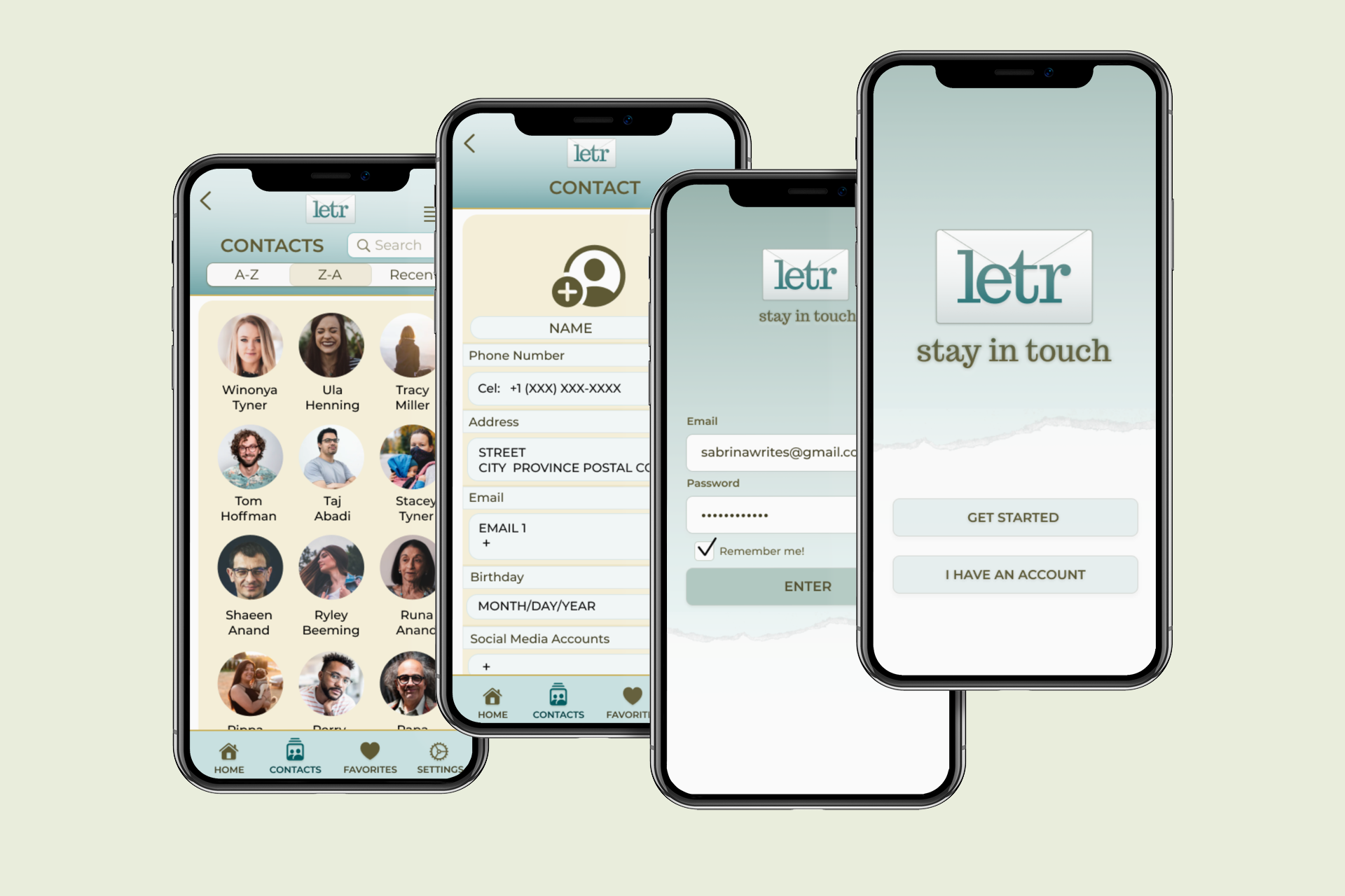
THE FINAL PROTOTYPE
The High-Fidelity Prototype can be found HERE

◊ Marketing Site Ideas
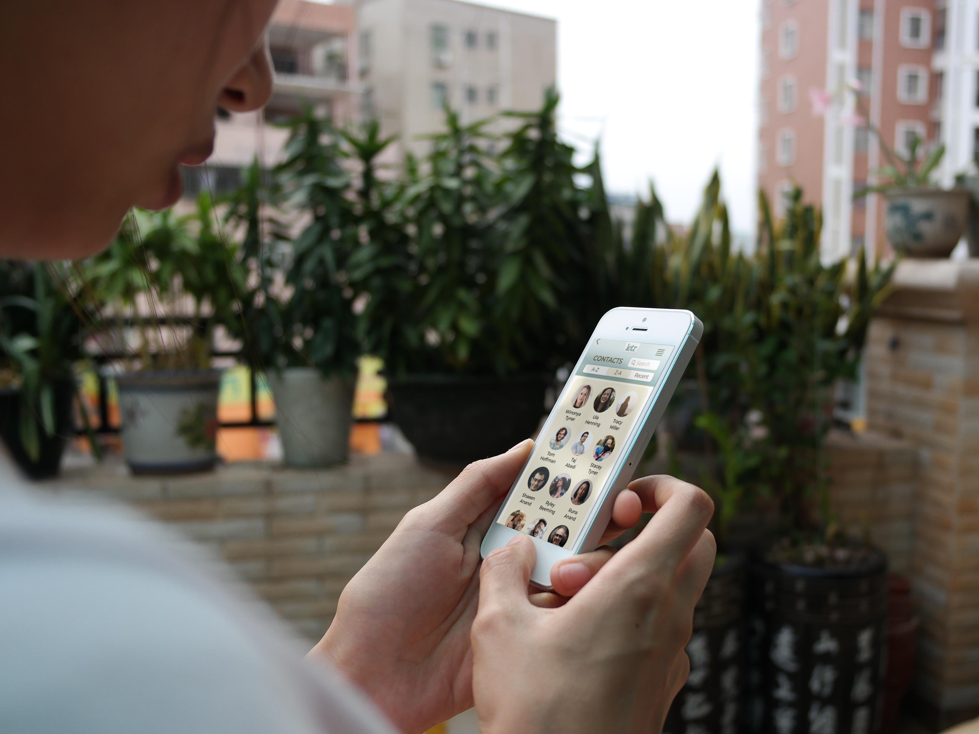
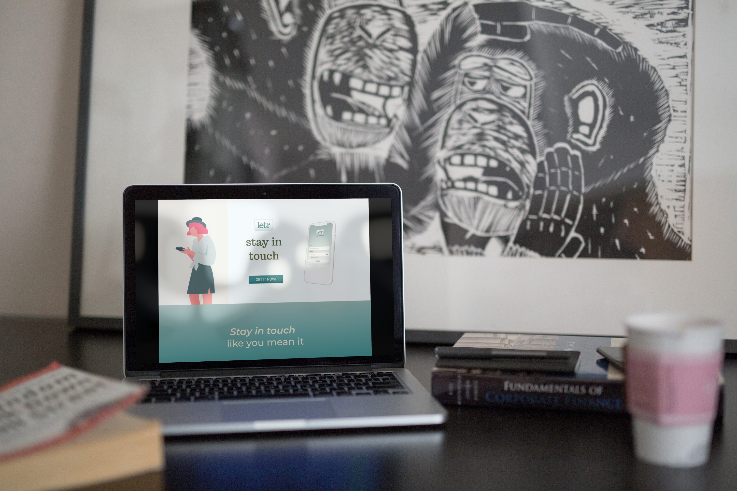
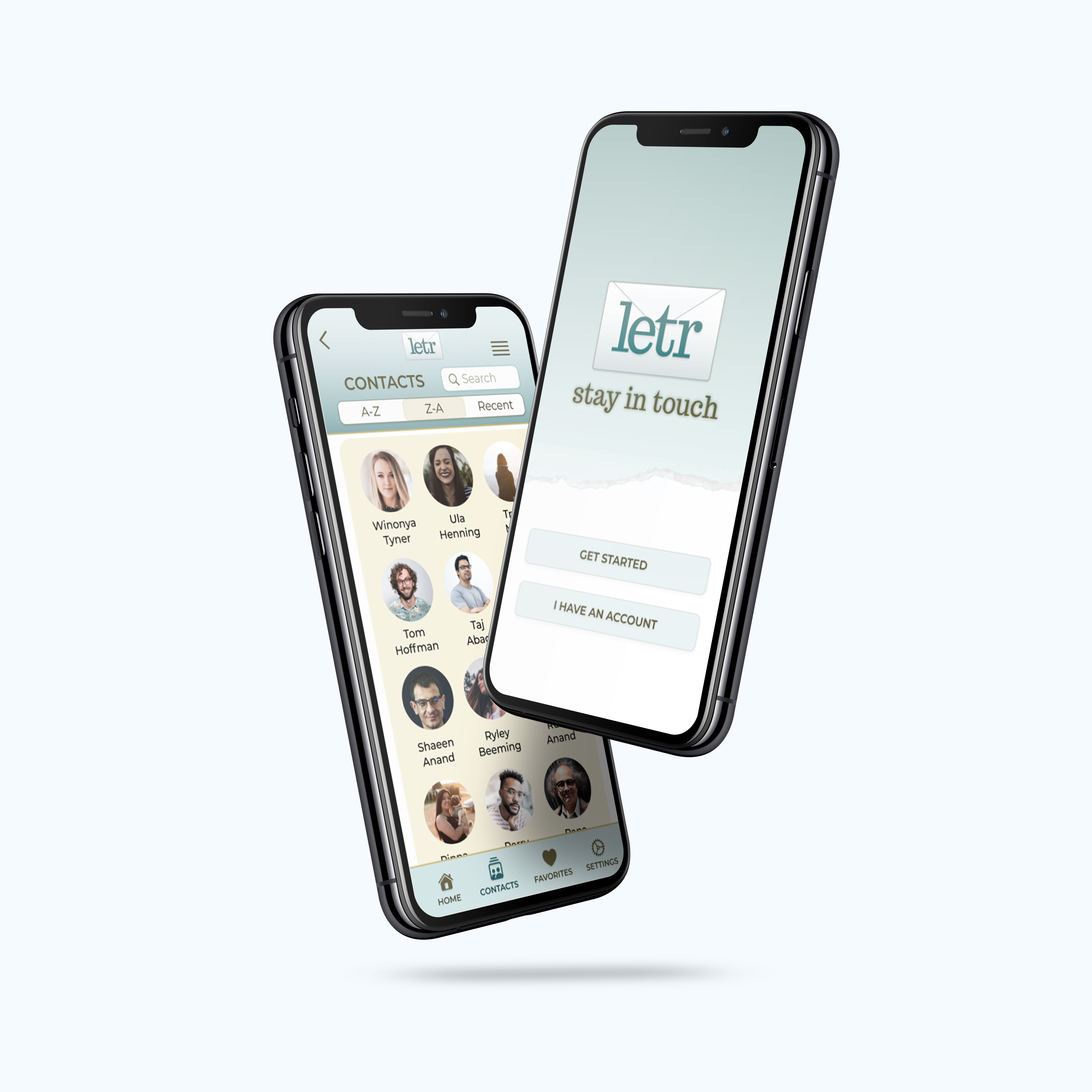
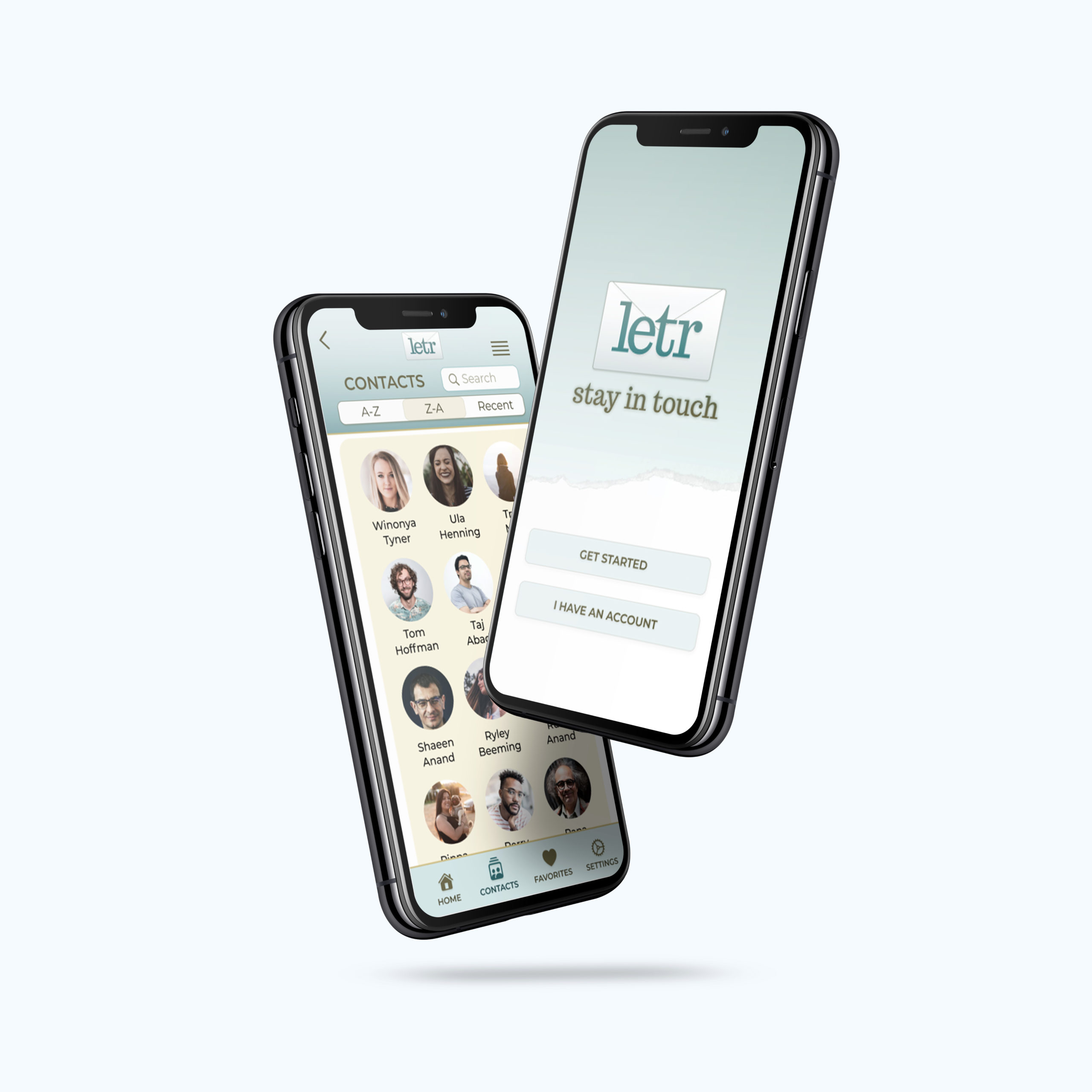
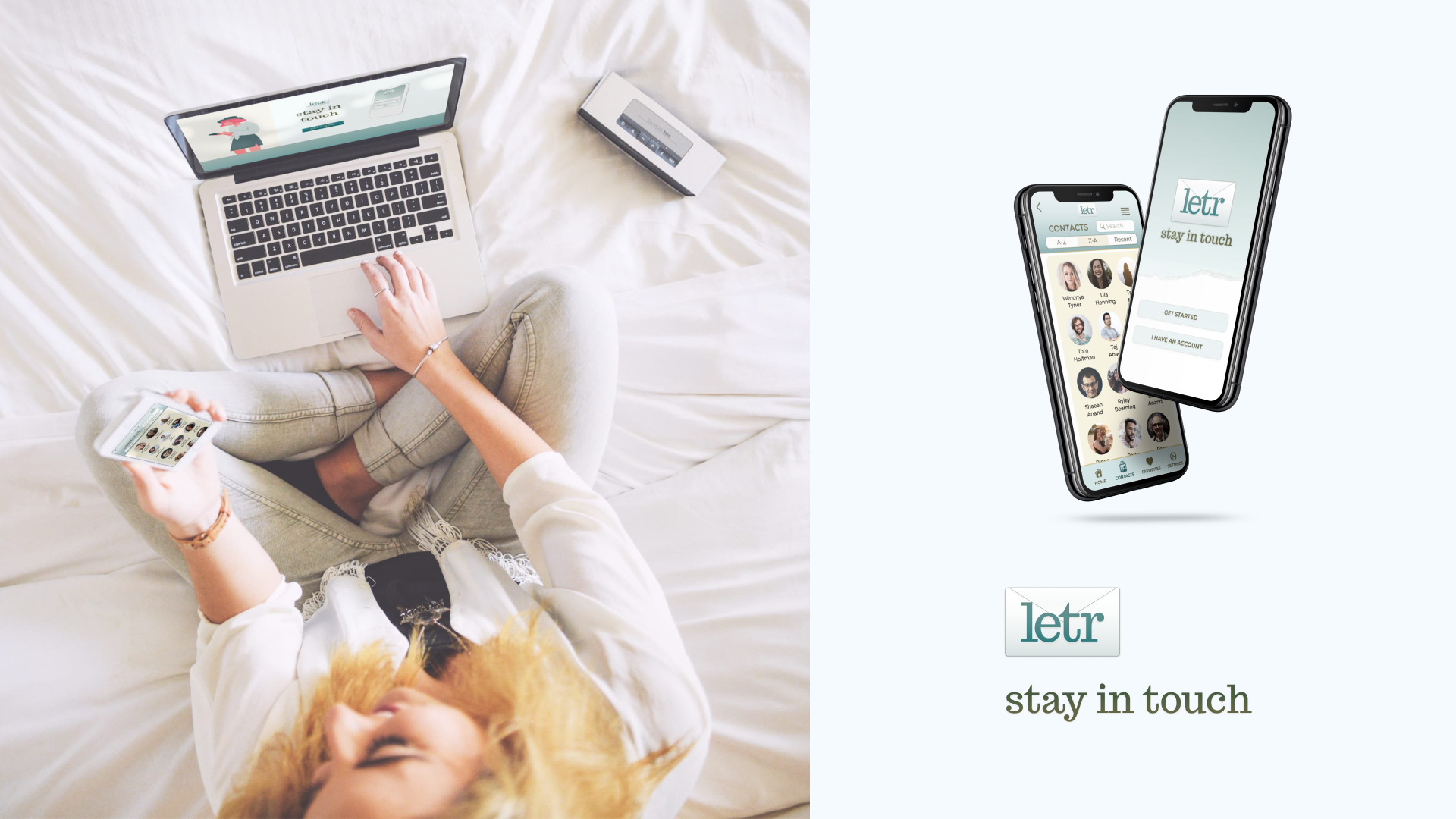
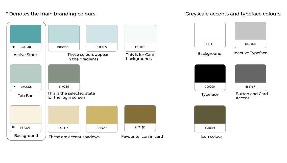
I put together a mockup for both website marketing and mobile marketing. I took into account the Brand Identity, feeling and Flat Design aesthetic to come up with an integrative concept.
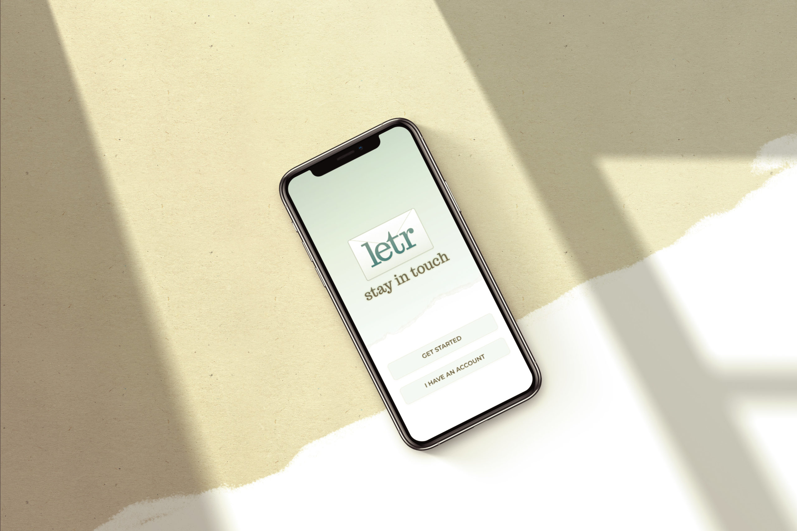
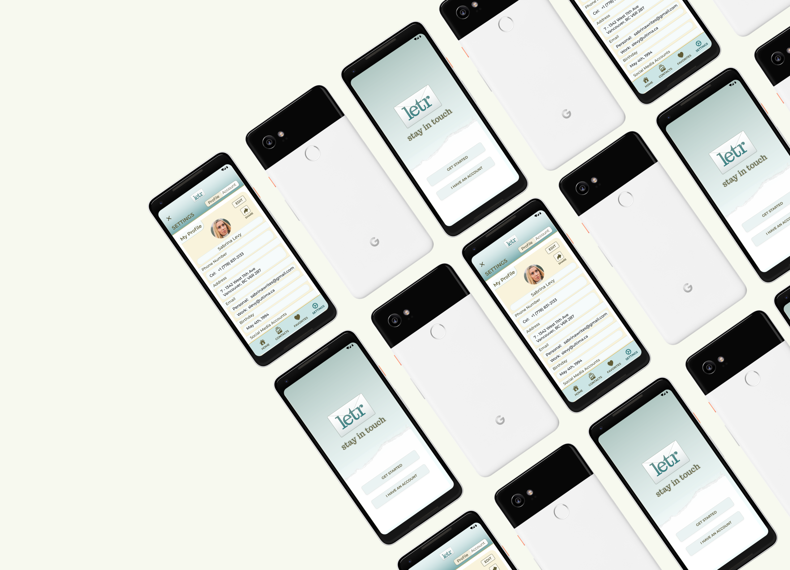
I have also created device mockups for advertising opportunities. Here are some examples of the Landing Page and Web App across platforms – iOS, Android and Web. Although the app was originally designed for iOS, ideally it would be platform-agnostic.
LINK TO DESKTOP MARKETING SITE PROTOTYPE

LINK TO WEB APP MARKETING SITE PROTOTYPE
